
Duluth fc
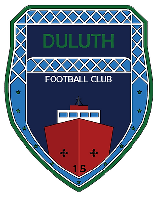
Duluth F.C. is an amateur football (soccer) club based in Duluth, Minnesota that plays in the National Premier Soccer League. They were looking for an update to their current logo (right), while incorporating several features in the new logo.
-
Aerial Lift Bridge
-
Enger Tower
-
Fleur-de-lis
-
Byzantine Cross
-
11 stars
-
2015
-
Duluth F.C.
-
Color Scheme of Blue and Green
"Our logo uses the blue and green from our city flag. It shows off the Aerial Lift Bridge and the Enger Tower, which are iconic sites in our city. It even displays 11 stars to show off our history. The city of Duluth was formed by the merger of 11 villages. The great seal of the city also displays 11 small stars for that historical purpose. We also include the fleur-de-lis to show the French heritage of the first European settlers of the city. Lastly, we have a Byzantine cross which identifies us as an organization with a Christian background although it is not a Church ministry."
- Tim Sas, Owner (See entire interview here)

Duluth F.C.'s current logo
My first reaction to this logo was to start with a shield design. After seeing ESPN's fantasy app (right), I saw that I could use the lift bridge as the border for the shield (like the blue and green in the ESPN App). Shipping is a large industry within the Duluth area, so I decided to try some designs with ships. I used the William A. Irvin, another landmark in Duluth, as an inspiration. I also incorporated the skyline part from The City of Duluth's logo (below) at this stage to see how it looked and had positive feedback. After some minor reconsideration from another source, that design was later modified to a simple shield with the features inside. I tweaked with some color combinations and fonts throughout the whole process. Also, I did not add a fleur-de-lis to any logo, all logos were intended to have these as well as crosses. Some logos have two crosses on purpose, where one was space intended for a fleur-de-lis. I also added the nickname, "BlueGreens", to see how that looked. Below, are some of the digital versions of my concepts, made in AutoCAD; many more were made on scratch paper. These are not final drawings nor are they logos intended for use, they are simply ideas portrayed to give Duluth F.C. a direction to go towards in rebranding their logo.

ESPN Fantasy App


City of Duluth logo
The most current concept design is pictured to the right. After going through many different ideas and concepts (see below), this one incorporated different aspects than those previous. A banner-like display for the nameplate, trees, and constellations were all new.
The skyline remained, representing the city; and beneath it, a more country like approach was attempted to showcase the northern Minnesotan atmosphere. Included in that theme, the little dipper and part of the big dipper are present with Polaris larger to represent the 11 stars for the 11 original Duluth towns. Two crosses were used in the trapezoid, one of which would be the fleur-de-lis.
Possible future ideas include looking at the upper left corner and figuring a way to use that space. Another approach I though of was to put the northern lights in the background on the bottom half. Lastly, another idea would be to include a few trees and a look across a lake on the bottom.
The color pattern is included in this concept, where the blue and green come from the current logo. The smaller green and blue colors are from the logo but are not part of the color scheme.
